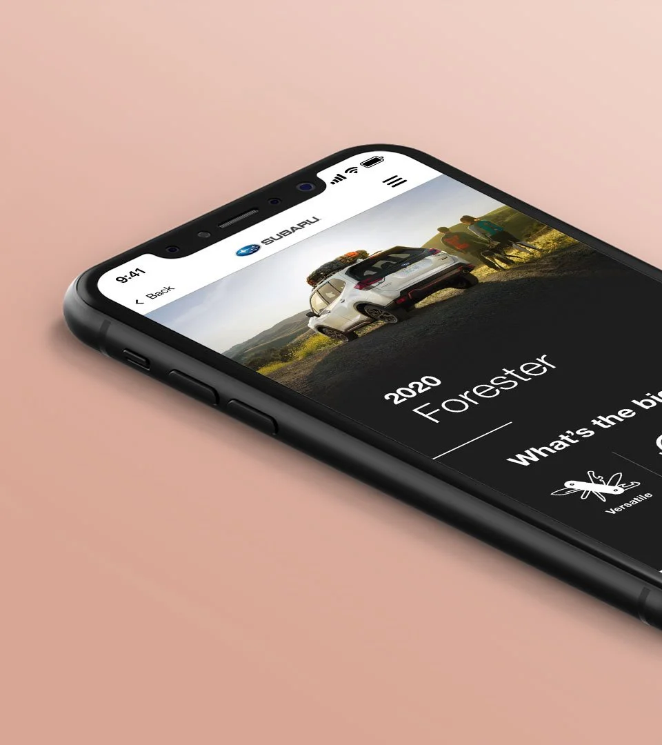
Subaru Autoshow Brochure
OVERVIEW
AGENCY: Designory, Inc.
CLIENT: Subaru of America
ROLES: Art Direction/UI Designer
TEAM: Creative Director, Art Director/UI Designer, UX Researcher, Strategist, Developer & Project Manager
BRIEF
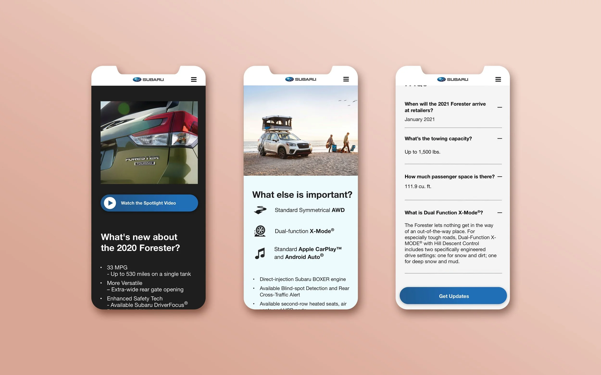
SUBARU ask the Designory to create an online brochure that would be linked to at their booth during the upcoming autoshows across the USA. They required the design to have:
a mobile driven approach
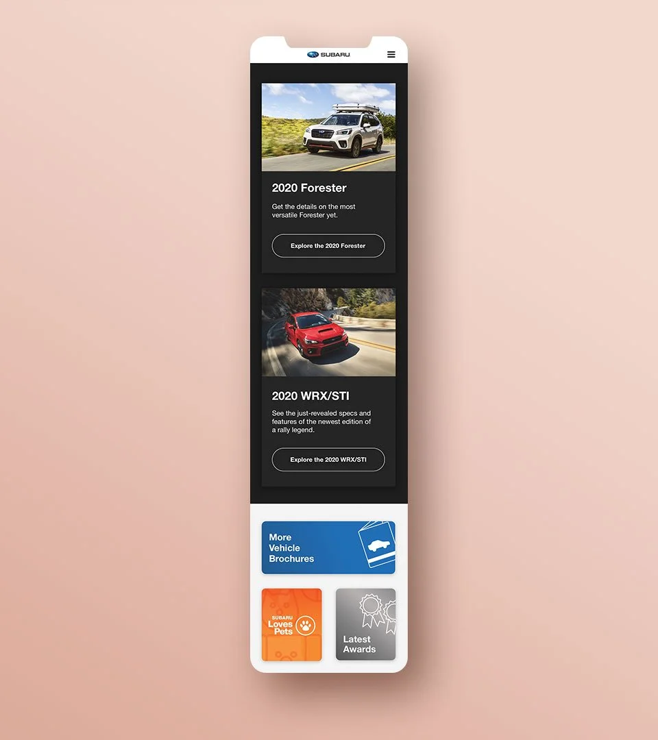
have enough information to replace the print brochures
easily digestible with a simple ui
have both top tier information along with an option for a deeper dive
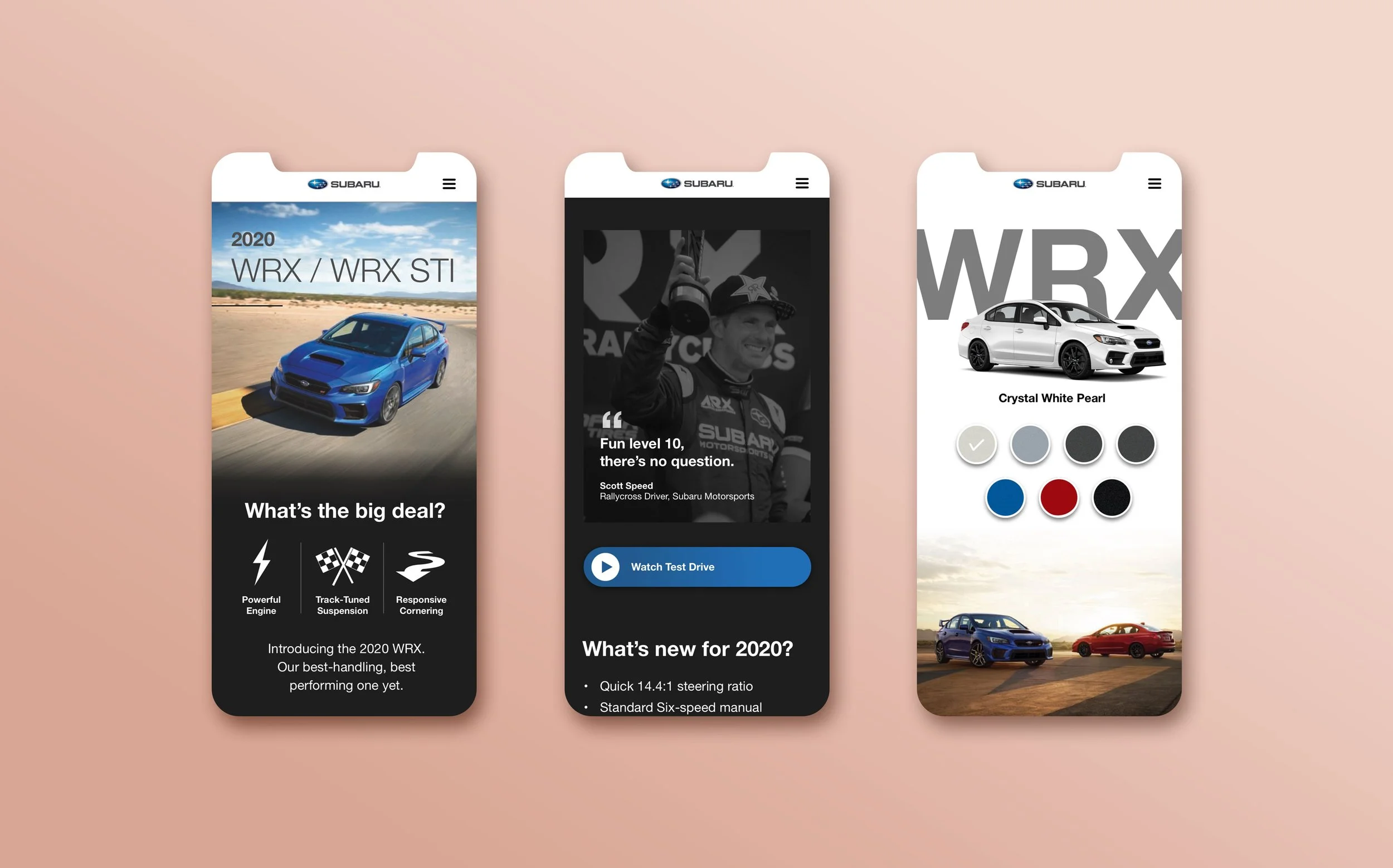
a competitor comparison chart
enticing design elements
GOALS
Create a mobile experience that was information dense
A web app that was visually interesting to keep someone’s attention when they are at a trade show
Simple to navigate and easily digestible
Light weight load speeds for on the go viewers
DEFINING THE AUDIENCE
The Considering Shopper*: someone who is on the fence about Subaru and looking for more information
The Aware Shopper*: knows about Subaru, but needs more information to convince them that Subaru is the right choice
The Auto Enthusiast*: loves Subaru-without a doubt- and just wants to geek out with the new releases
* Names/Concepts created by Strategist reworked by Sarah B.
THE RESEARCH
Offering a “save for later” feature would be beneficial
Need to make the experience as easy to absorb as a print brochure
For these specific users they would ultimately use the web app as a tool throughout the trade show to compare other brands
THE VIBE
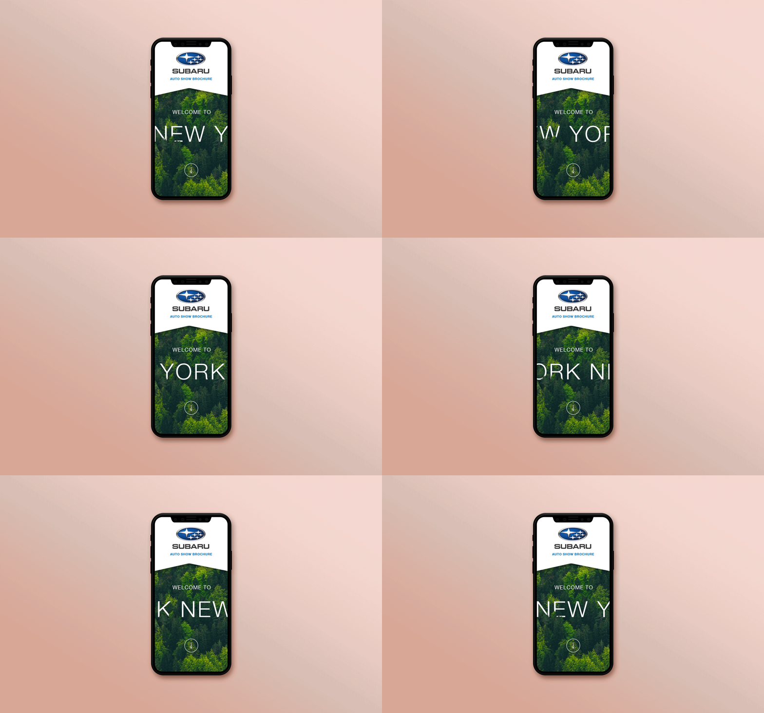
Adventurous- visuals showcasing the new models
Minimal yet immersive
Incorporating gifs/videos where able- without losing load speeds
A good medium of lux and nature enthusiasts- but not Jeep
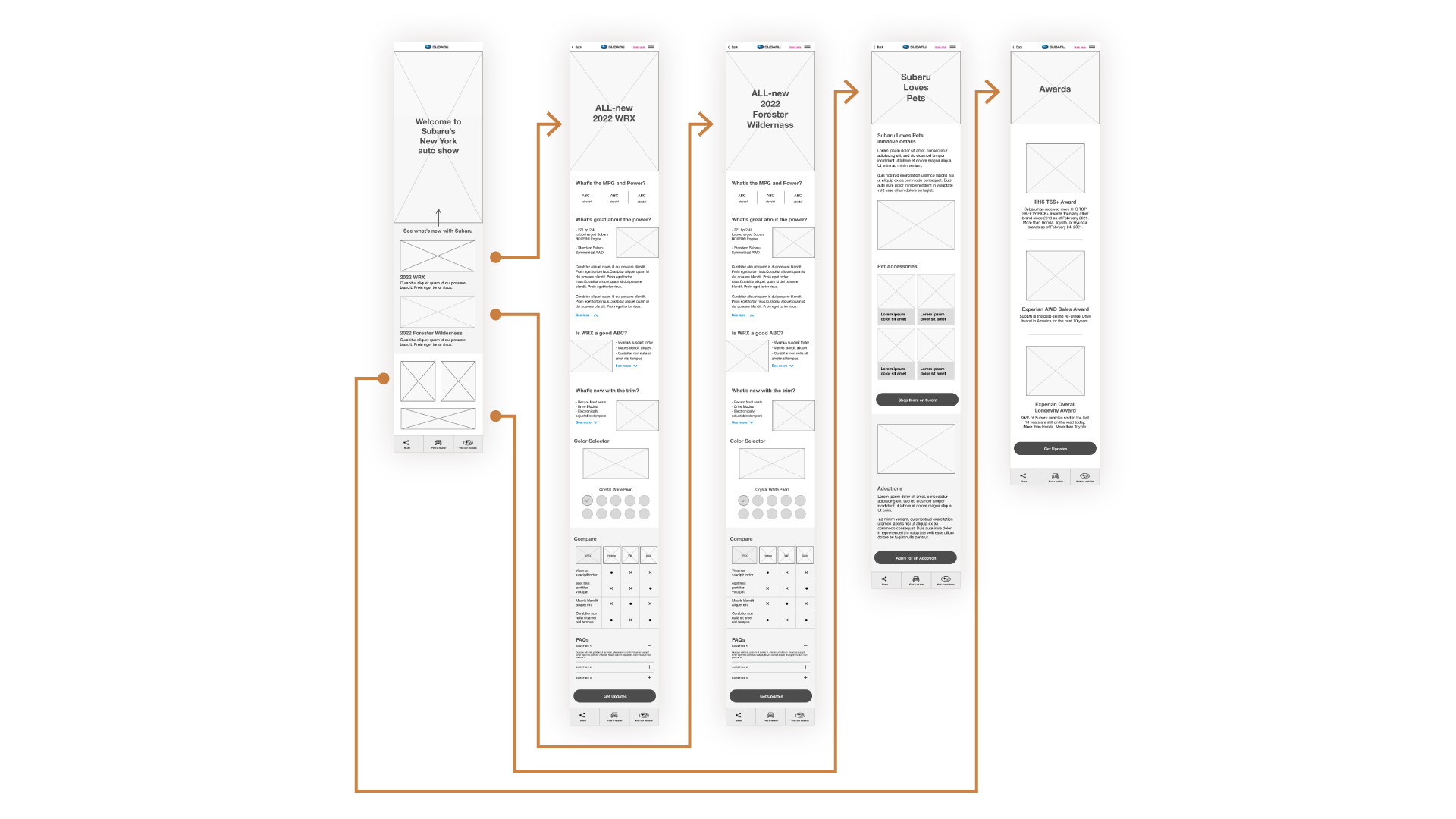
WIREFRAMES
Designed by Sarah B. / Map Flow Built by UX Researcher & Sarah B.
TESTING
Most time spent on comparison chart
People would like independent third party reviews
People wanted more models included along with safety and pricing information
CONCLUSIONS
The messaging was consistent with what the client was asking for
The design was engaging and interesting to explore
The comparison charts were a success with consumers and client


